Hi community,
I’m doing some data pulling and wanted to share some common criteria I’ve been using. Feel free to comment with your tips! There’s no actual “data analysis” in this thread, more data charting, as your analysis will be specific to your data.
Related threads:
Tracking payment data: Data tracking: Order Payment Method Source Origin and Reason to Buy
Mail list, donors over $100: I want to create a mail list of everyone who has given $100 or more over multiple years
Ticket buyer behavior: Reports for a Data Analysis
Today’s task is to make a bar chart with the number of donations per year, for the past three fiscal years, separated by giving level. If the same donor donated twice but at two different giving levels, that’s two donation counts.
My initial thoughts were:
- Mail list with all donors, not including ticket refunds but including soft credits, including anonymous donors, since 2014-2019. Report > Export ‘Donation Data for Patron with each gift’
- Donation program listing level obtained.
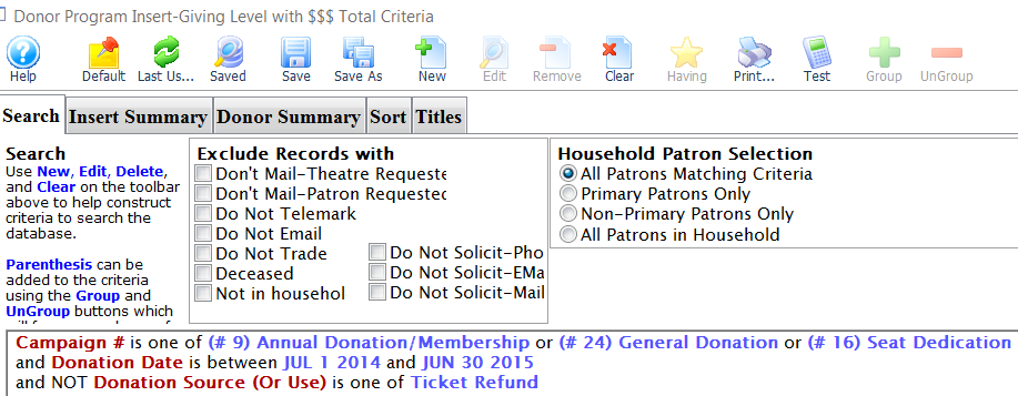
- Otherwise, I could run a report “Donor Program Insert - Giving Level with $$$”, summarize “each donation individually”, and export each year into excel, then count the cells in excel.
Option 3 seemed fastest.
- Open a patron and check data is correct, export to excel format. Some of the giving level names didn’t export, and some levels have changed over time. The report puts the giving level name up top, but for my excel formula to work it refers to a cell in the same row, so I need to add a column with a consistent giving level.
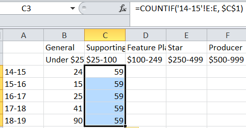
- In excel: One tab “count” with five other tabs with the data for each year. Press F2 to edit a cell, then use excel formula: =COUNTIF(‘14-15’!$E:$E, “General”),
- Create chart, make the chart colors consistent.